Reversing SKU mix decline
A multi-year experimentation initiative that reversed a sustained decline in premium product adoption and delivered multi-million dollar incremental revenue growth for QuickBooks Canada.
A multi-year experimentation initiative that reversed a sustained decline in premium product adoption and delivered multi-million dollar incremental revenue growth for QuickBooks Canada.
The short version: Annual price increases had eroded premium SKU adoption in Canada over multiple consecutive years, weakening acquisition revenue quality and reducing the average revenue per customer. The business needed a design-led approach to shift how visitors considered and chose between plans, without compromising overall acquisition volume.
What followed was a sustained experimentation initiative spanning pricing page redesign, feature messaging refinement, SKU simplification, and personalized upsell experiences. The result was a significant reversal of the decline, a measurable uplift in premium adoption, and Canada establishing itself as one of the strongest-performing international markets for premium product mix.
My role: Creative lead on the initiative, guiding a team of designers across concept, design execution, user testing, results analysis, and final approvals, in close collaboration with marketing and development teams.
Over several years of annual price increases, premium SKU adoption in Canada had declined significantly from its historical benchmark. Visitors were increasingly choosing lower-tier plans, which reduced the quality of new customer revenue and put pressure on growth targets.
The challenge was not simply one of pricing or product. It was a design and communication challenge: visitors were not seeing enough differentiation between plans to justify the premium options, and the purchase experience was not effectively guiding consideration toward higher-value offerings.
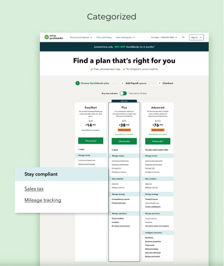
Starting with the fundamentals. Before running experiments, the team assessed the existing pricing page and plan communications with fresh eyes. Feature messaging across SKUs had accumulated over time in ways that blurred the distinction between plans rather than sharpening it. One of the first bodies of work was a series of experiments focused on how features were named, framed, and positioned for each SKU, with the goal of making the value of each tier clearer and more distinct.
Simplifying the product lineup. Working with marketing and product, the team tested a simplified plan structure, reducing from four SKUs to three. The SKU removed was the second lowest tier, a deliberate choice as removing it created cleaner differentiation across the remaining plans and made the value step between tiers more legible to visitors. The pricing card design was updated to reflect the new structure, with language adjusted to support the repositioned hierarchy. Later in the initiative, a version of the removed SKU was reintroduced in a less prominent placement to address a separate short-term acquisition goal, demonstrating the flexibility of the experimentation approach in responding to real business needs.
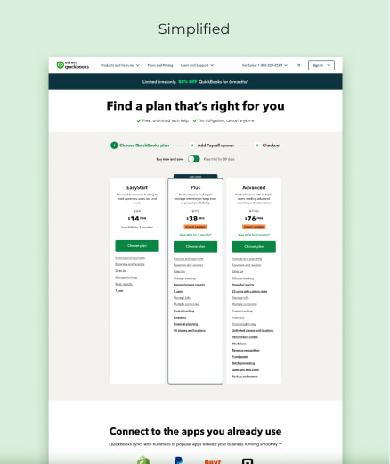
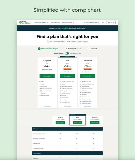
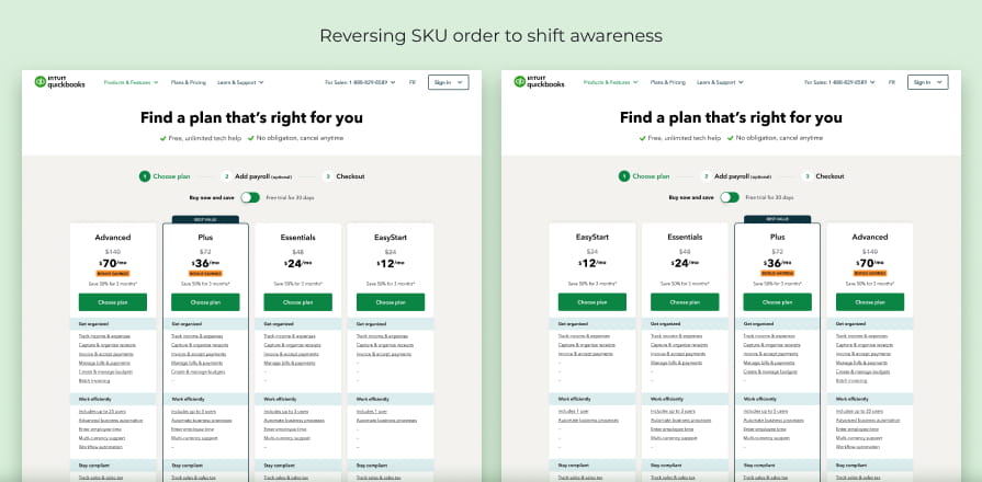
Getting visitors to consider premium. Moving visitors toward premium SKUs required working at multiple points in the purchase journey. The team experimented with deeper discounts on premium plans, attention-getting messaging on pricing cards, and placement and framing changes across the page. One experiment tested reordering the SKUs from highest to lowest to understand the impact that presentation order had on awareness and consideration of the higher-value options. Each experiment was designed to isolate a specific variable so the team could understand what was actually driving behaviour rather than attributing results to multiple changes at once.
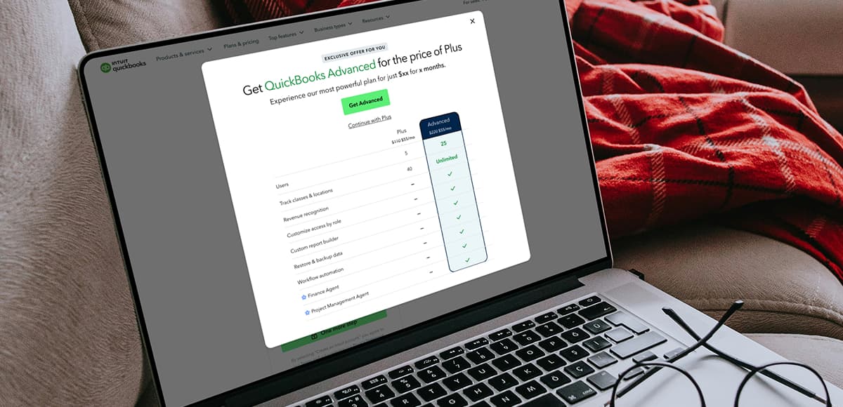
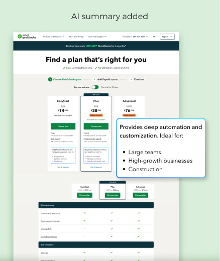
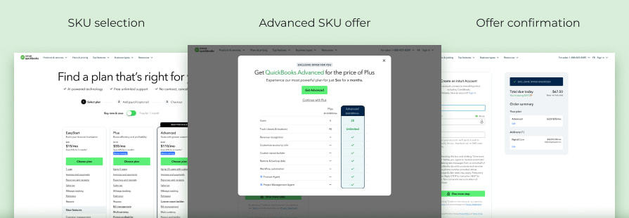
The upsell experience. For visitors who had already selected a premium plan but not the highest-tier option, the team designed a targeted upsell experience. Two implementations were developed to accommodate different user flows through the purchase journey: a pre-purchase message before the final checkout stage, and promotional messaging within a shopping cart experience. Both presented visitors with a special offer to upgrade to the highest SKU at the point where they were most engaged. The experiment ran for approximately one month before the results were strong enough to transition it to the default experience.
Learning from what did not work. Not every experiment moved the needle. Some showed no measurable impact. Others were significant enough misses that the initiative was paused and the approach reconsidered. In each case the team captured what the result revealed, and that learning informed the next experiment. The discipline of running smaller, focused experiments rather than large sweeping changes was what allowed the team to build a clear picture of what actually drove consideration and conversion.
The initiative reversed a multi-year decline in premium product adoption. Premium mix increased by more than 20 percentage points. Adoption of the highest-value offering increased by more than 7 percentage points, nearly quadrupling its share of new customer acquisitions. Multi-million dollar incremental revenue growth was delivered while acquisition volume was maintained. Retention remained healthy across premium cohorts, demonstrating that the uplift reflected genuine customer value rather than short-term promotional behaviour. Canada became one of the strongest-performing international markets for premium product adoption.
The most important discipline on this initiative was patience with the process. Reversing a multi-year trend through design and experimentation requires a willingness to run experiments that fail, learn from them specifically, and keep building toward a clearer picture of what works. The temptation in that kind of environment is to make sweeping changes and attribute any movement to the whole. The team’s commitment to smaller, isolated experiments made the results legible and the learning transferable.
The upsell experience is a good example of the broader principle. The end result was not complex. But the path to that simplicity required hard work, craft, user testing, and careful prioritization across dozens of experiments. What made it work was placing the right message, with the right offer, at the right moment in the journey for the right visitor. Getting all four of those things right required everything that came before it.