Medtronic global campaign
A product launch campaign for a new line of pacemaker leads, developed in Toronto and adapted for North American and European markets.
A product launch campaign for a new line of pacemaker leads, developed in Toronto and adapted for North American and European markets.
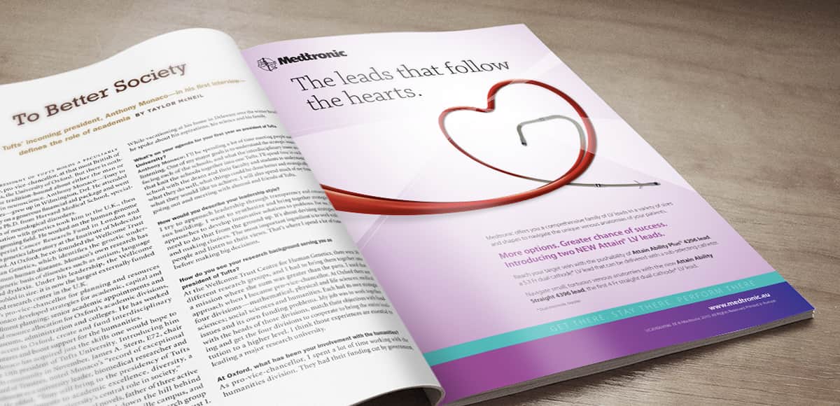
The short version: Medtronic was launching a new line of pacemaker leads, the flexible connectors used to implant pacemakers into patients. The product’s key differentiator was its exceptional flexibility, allowing surgeons to navigate the anatomy of the heart more easily than existing options on the market. The brief was to communicate that flexibility to medical professionals in a way that was compelling, accurate, and approvable.
What we developed was a campaign built on the visual language of the product itself, shaping the connectors into recognizable forms that demonstrated their flexibility while anchoring the work in the emotional resonance of the heart.
My role: Senior Art Director on the project, developing the concept and creative in close collaboration with my copywriter partner. The campaign was led out of our Toronto office, with input from our other agency offices during development.
The audience for this campaign was medical professionals: surgeons and cardiologists who are familiar with the existing products on the market and the technical demands of implantation. Communicating a product advantage to that audience requires precision, credibility, and a creative approach that respects both the intelligence of the reader and the seriousness of the context.
The flexibility of the new Medtronic leads was the story. The creative challenge was finding a way to show it, not just say it, in a way that would resonate with an audience that had seen many competing claims.
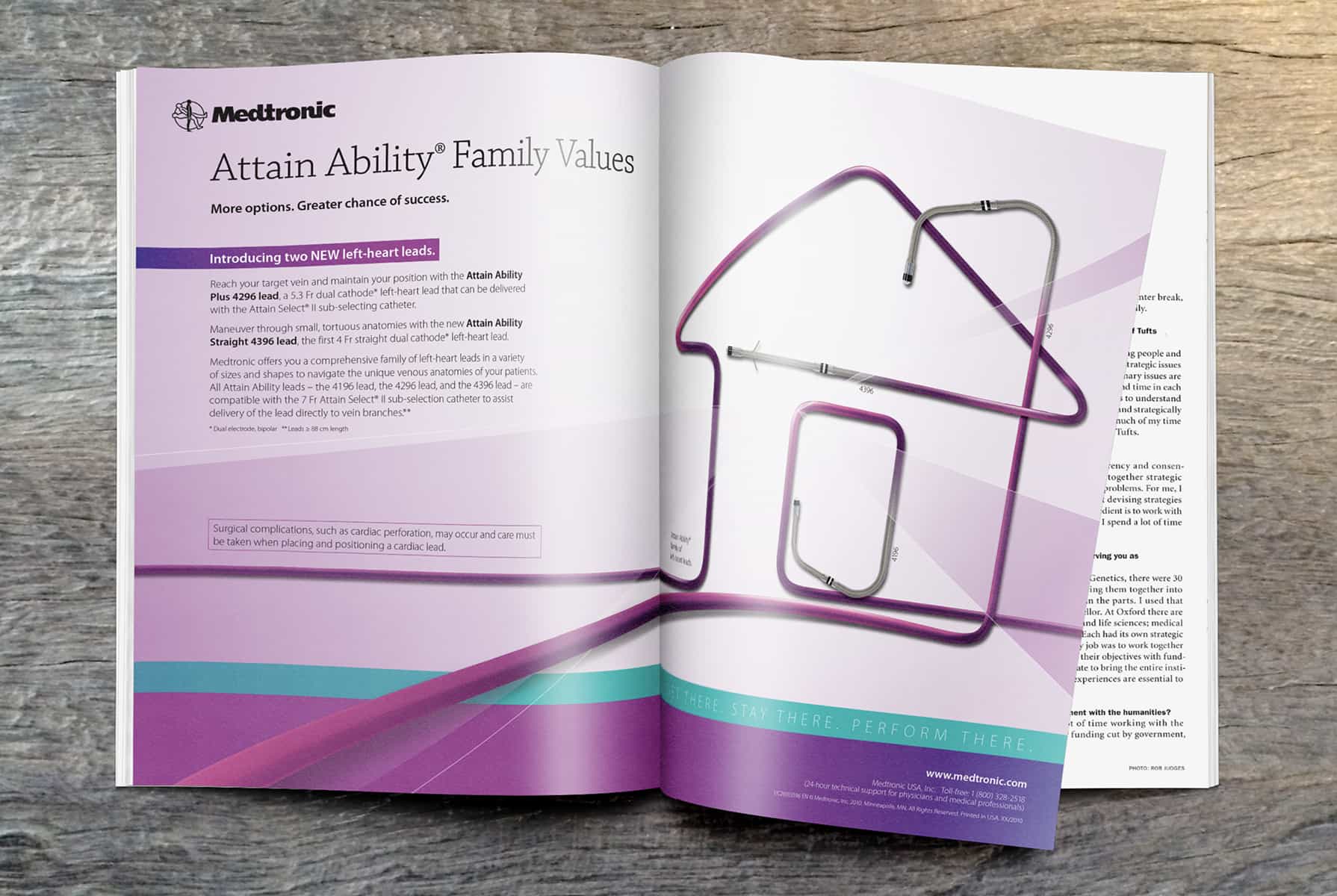
Finding the concept. The leads themselves suggested the answer. Long, flexible tubes with hooked ends, they could be shaped into almost anything. Working with my copywriter partner, we landed on a concept rooted in turns of phrase built around the heart: home is where the heart is, follow your heart. We then visualized those phrases literally, shaping the leads into a house and a heart. The result was a campaign that demonstrated flexibility through the form of the product itself, while grounding the work in language that carried emotional weight even in a clinical context.
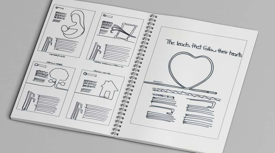
Navigating the approval process. Medical device advertising requires client approval on the artwork itself, not just the copy. The visual representation of the product’s flexibility had to be accurate enough to be credible without overpromising what the product could do. Working through that approval process was a meaningful part of the project, ensuring the creative held up under scrutiny without losing what made it compelling.
Adapting for international markets. The campaign was originally conceived as a single execution intended to run across North America and Europe. During development, input from our other agency offices revealed that the turn of phrase anchoring the ad did not resonate in European markets. Rather than forcing the concept where it did not fit, we developed a second execution for Europe. The result was two distinct ads, each tailored to its market, while maintaining the same underlying visual concept and creative logic.
The campaign was well received by the client and ran in trade publications across North American and European markets.
The strongest creative decisions on this project were made by looking closely at the product itself. The leads were not just the subject of the campaign, they were the medium. Shaping them into recognizable forms was a way of showing the product’s capability rather than describing it, which is almost always the stronger choice in advertising.
The European adaptation was a good lesson in the limits of assumed universality. A concept that feels self-evident in one cultural context can fall flat in another. Getting that feedback early, during development rather than after launch, was what allowed us to address it without compromising the work.