giraffe & friends
A full brand build for a new RESP provider: from competitive audit and naming through identity, guidelines, website, and TV launch.
A full brand build for a new RESP provider: from competitive audit and naming through identity, guidelines, website, and TV launch.
The short version: A new RESP provider came to us ready to go to market but without a brand that could get them there. What they needed was an identity that could help them enter a crowded, undifferentiated market and connect with their audience, new parents, in a way no one else in the category was doing.
What we built was giraffe & friends: a playful, warm, and deliberately approachable brand that stood apart from a category built almost entirely on weight and seriousness.
My role: Associate Creative Director on the project, contributing to the brand strategy and leading the creative direction and execution across all touchpoints from identity through TV launch.
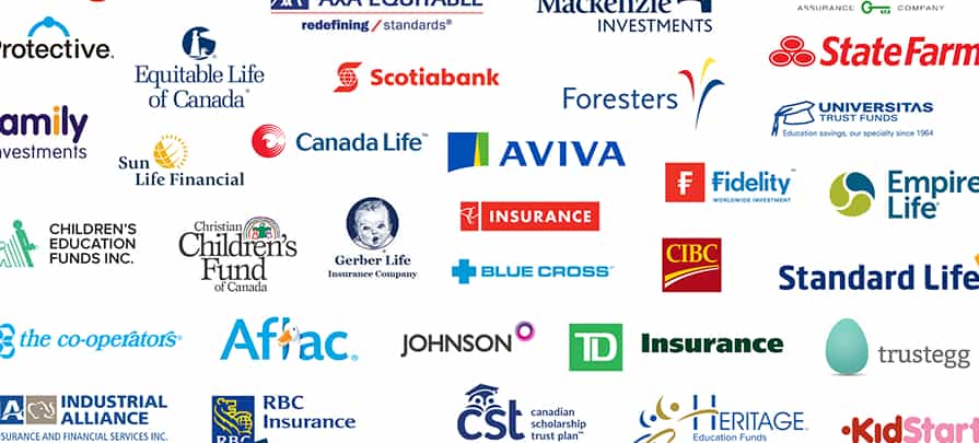
The RESP category had a problem. When we looked at the competitive landscape, almost every provider told the same story: serious, old-world financial institutions leading with protection, security, and the gravity of planning for a child’s future. The design language was bank-like. The tone was formal. The category leaned heavily on weight and seriousness.
The result was a space that was not only undifferentiated, but that left real room unoccupied. No one was leading with caring. No one was leading with warmth. No one was making it easy or inviting to engage with.
That gap was the opportunity.
Finding the name. The client came to us as Provenance Life Insurance, a name that carried none of the warmth or accessibility the brand needed. Working through the competitive context and the audience, we landed on giraffe & friends. The name needed to do several things at once: feel approachable and memorable for new parents, carry a sense of personality, and create space for a broader cast of characters. The giraffe brought the right qualities: gentle strength, an elevated perspective, individuality, and a natural sense of aspiration. The friends brought variety and inclusivity. The name was pitched to the client and approved.
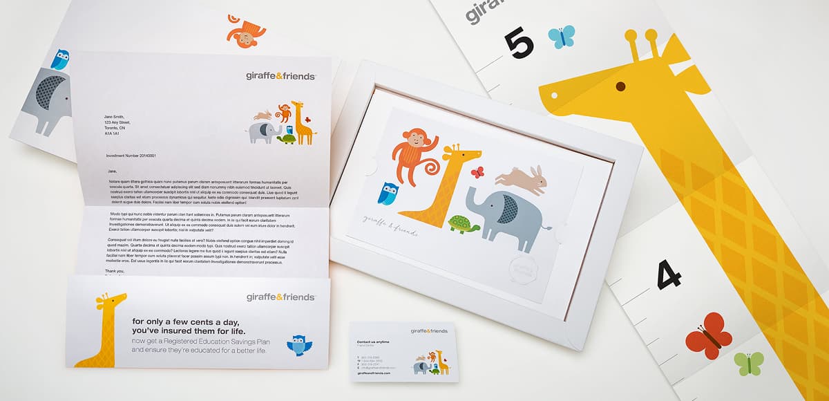
Building the visual identity. The visual direction was graphic, bold, and deliberately designed to fit into the world new parents already lived in. Simple character illustrations of the giraffe alongside an elephant, turtle, rabbit, butterfly, owl, and monkey, each with distinct colour palettes and patterns drawn from the animal itself. The aesthetic was intentional: this was not a financial brand trying to look friendly, it was a brand that belonged in the same visual world as the books, toys, and nursery art these parents saw every day.
Full brand guidelines were developed to govern how the identity would be applied consistently across every touchpoint.


Commissioning the characters. The illustrations were created by a commissioned illustrator working to our creative direction. Getting the characters right was critical: they needed to carry the brand’s personality, hold up across scales from a social post to a TV spot, and feel cohesive as an ensemble.
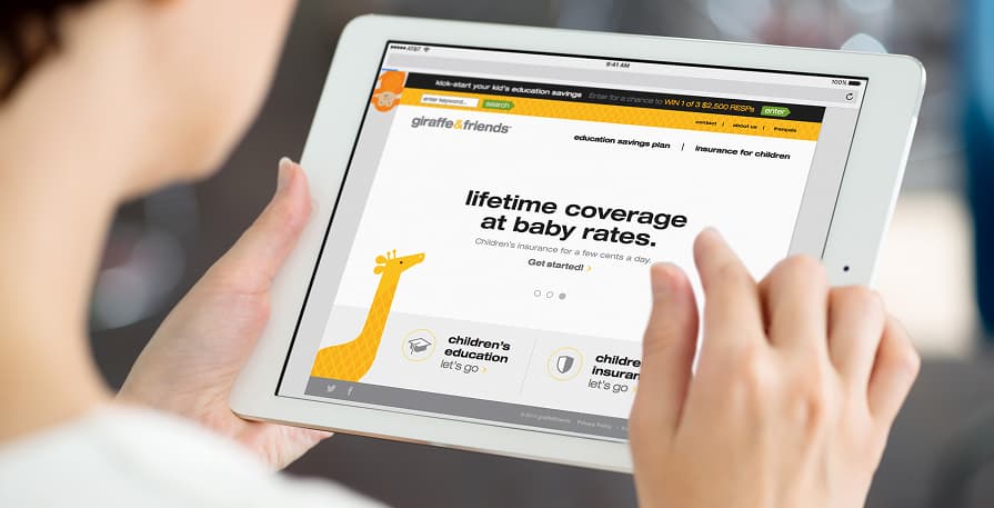
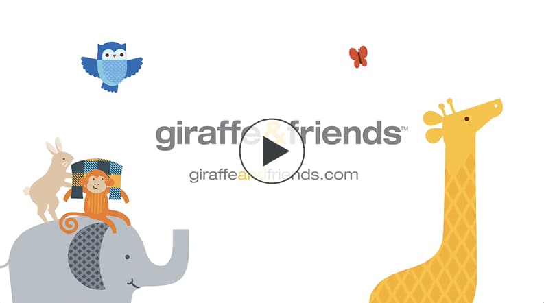
Bringing the brand to life. The full scope of the launch covered: brand guidelines, social posts, welcome kits for new customers, a website where parents could explore contribution options and register, and a 20-second TV spot that introduced giraffe & friends during family-oriented programming. The welcome kits included small details designed to delight, including a growth chart featuring the giraffe among them. Every touchpoint was an opportunity to reinforce the warmth and approachability the brand was built on.
giraffe & friends launched into the RESP market as a brand that looked and felt unlike anything else in the category. Honest, approachable, and warm in a space built on weight and seriousness, the brand gave them a distinct identity from day one.
The brand resonated with new parents as intended. Audience connection was built through a communication style that respected what parents actually cared about, rather than leading with fear.


The most important decision on this project was made before a single visual was created. The competitive audit revealed not just what competitors were doing, but what they were all doing the same. The strategic choice to occupy the caring and thoughtful space, rather than compete on the same serious and formal ground as everyone else, was what made everything that followed possible.
The visual identity succeeded because it was designed from the audience’s perspective, not the category’s. New parents do not live in the world of financial services. They live in a world of colour, character, and warmth. Meeting them there, rather than asking them to adjust to a financial register, was what made giraffe & friends feel genuinely different.